How to Spice Up Your SAC Stories

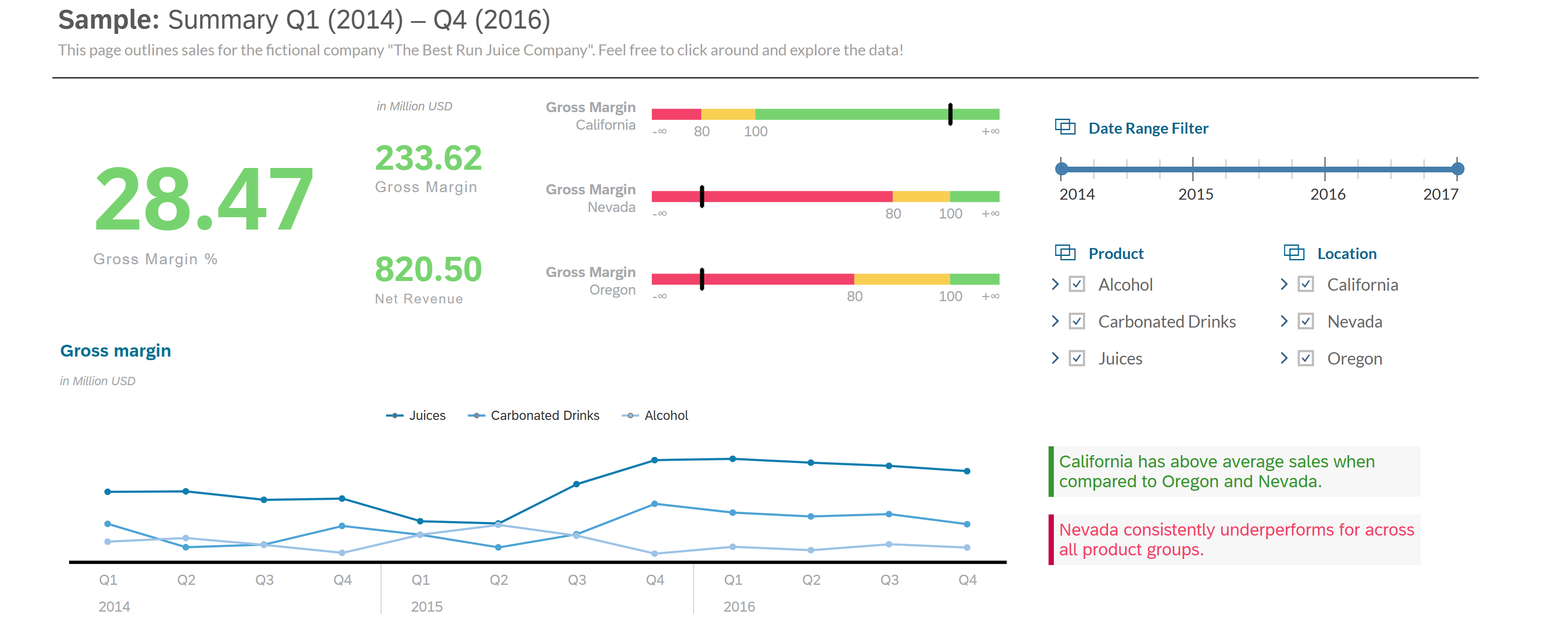
SAP Analytics Cloud (SAC) is a fantastic tool to visualize data and bring together data from different models into one intuitive story. We’ve all seen and are familiar with stories with colorful and beautiful charts like this:
But have you seen charts like these?
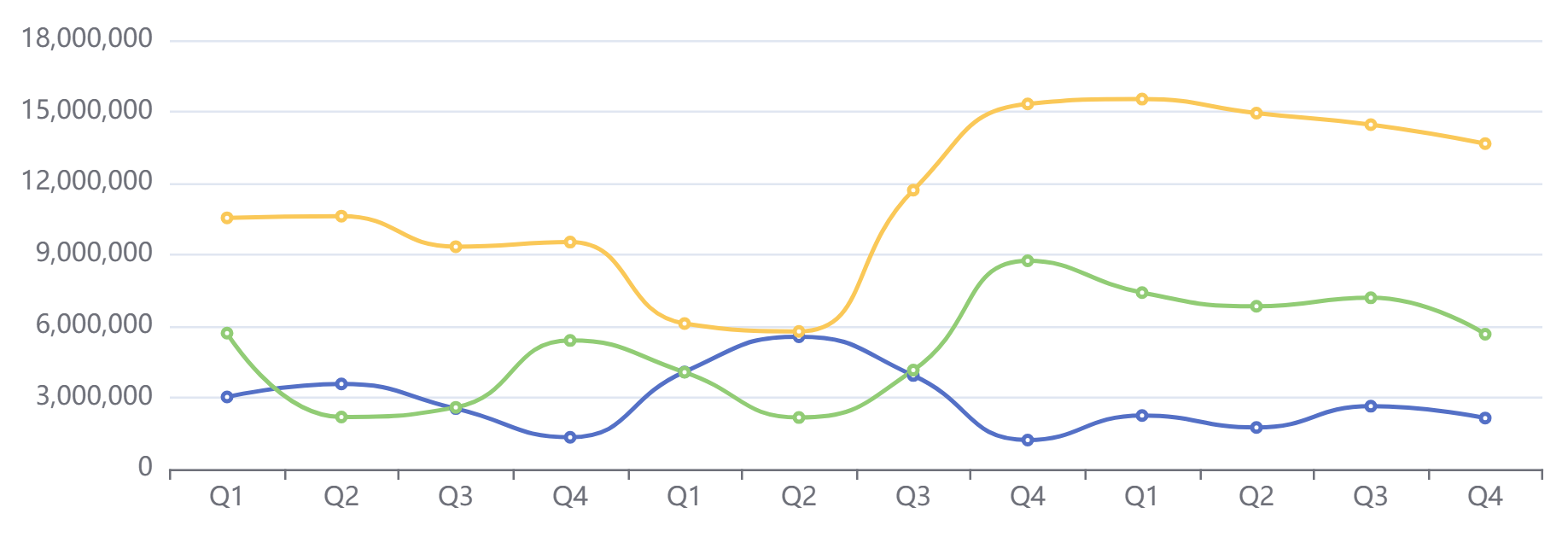
This is the same chart that you see under Gross Margin in Figure 1. It's the time series in the lower left corner of the first story we are very familiar with, but it adds colors and a Y axis that is visible in place to give more context to the information displayed.
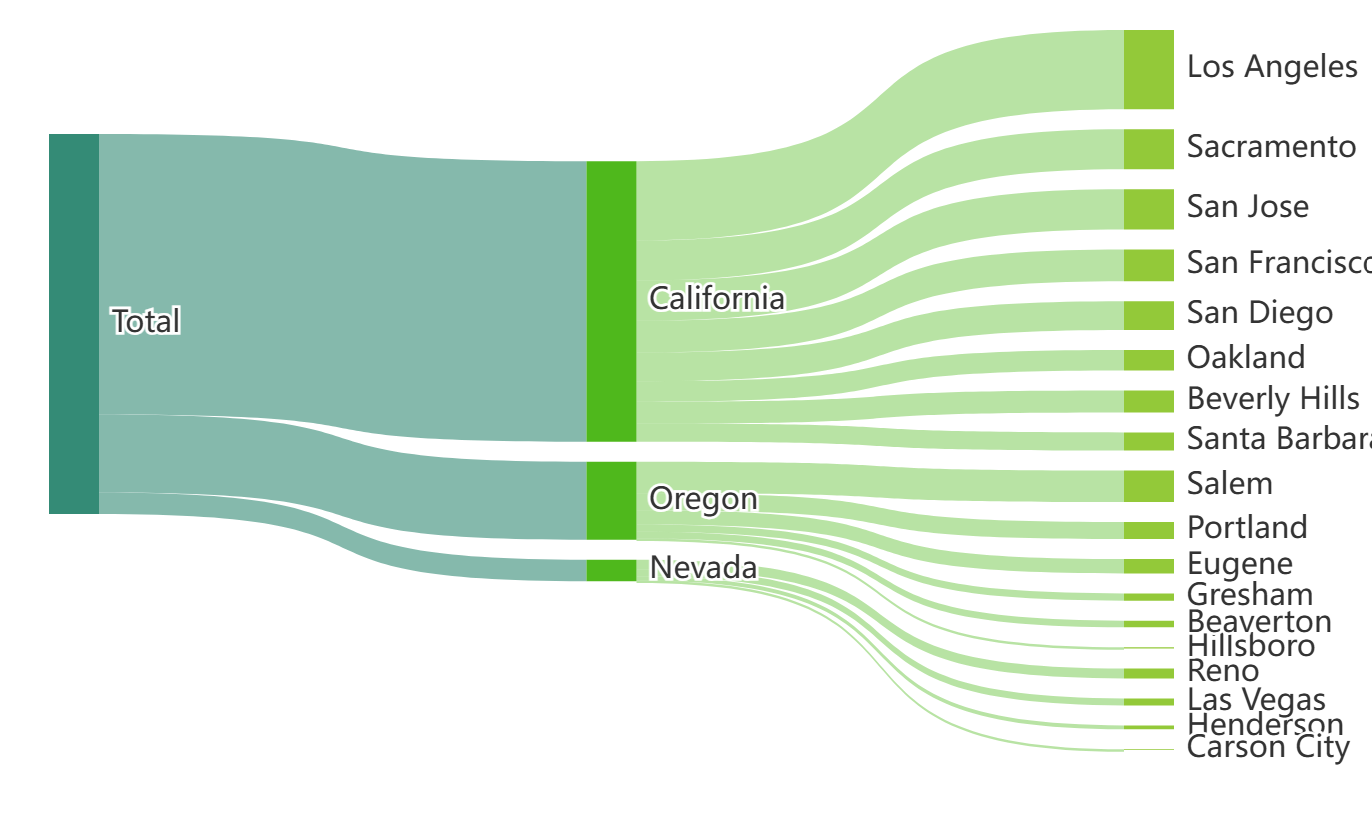
What about the following charts? Wouldn't it be great if we could have some charts that give new functionalities to SAC? Like a Sankey Plot (see Figure 3).
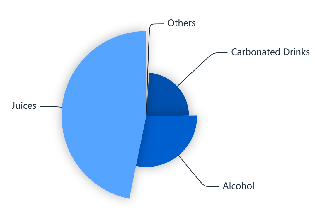
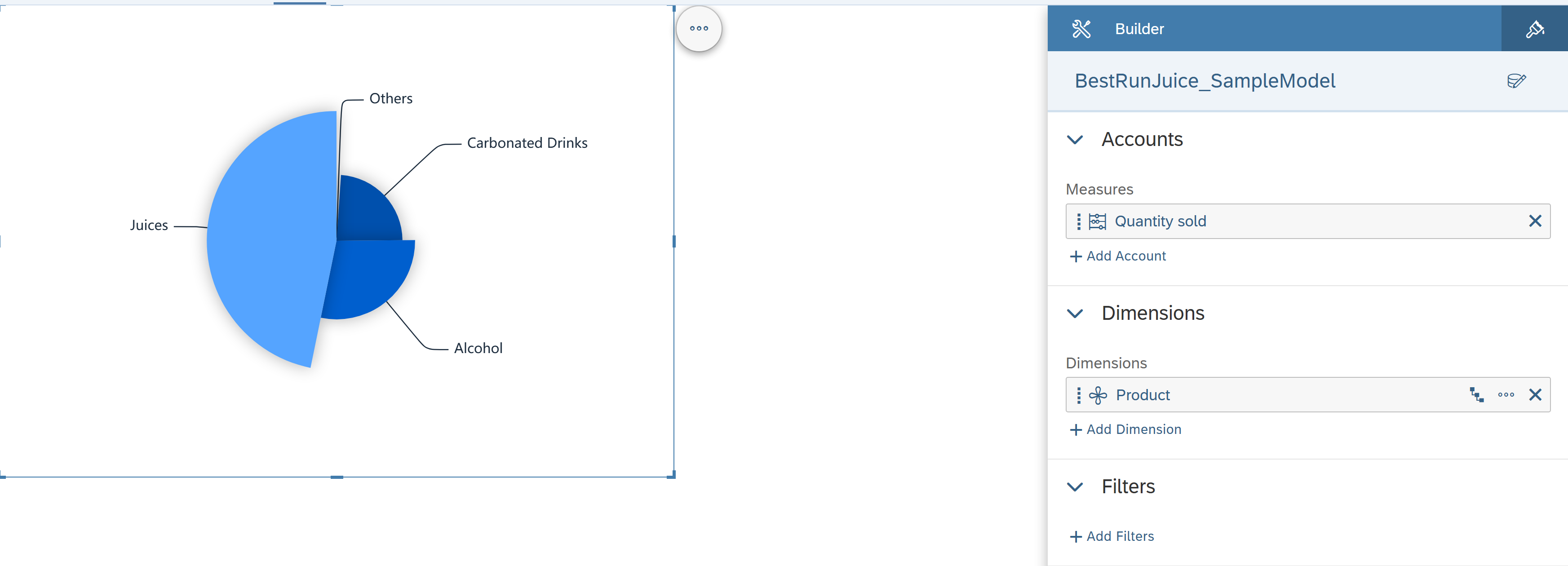
Or a Pie Chart (see Figure 4) that clearly shows the difference in magnitudes instead of having to rely solely on the imperceptible degrees of the angles. This fixes the known problem that most pie charts have as soon as you have more than 2 elements in them.
Now you must be asking yourself, are these even SAC Charts? And even if they are, how do I get them? You probably must be a senior developer to implement these, right?
Let me tell you that these are fully functional SAC charts. They are called Custom Widgets. And they work in an analogous way to any other SAC out-of-the-box chart. And the best part is that they are very easily implementable into any SAC tenant. Let me show you how.
SAP’s Product and Topic Expert “marouferchichi” has already done most of the heavy lifting for us, by providing us with GitHub repository to just download some sample Custom Widgets. This is how you implement them.
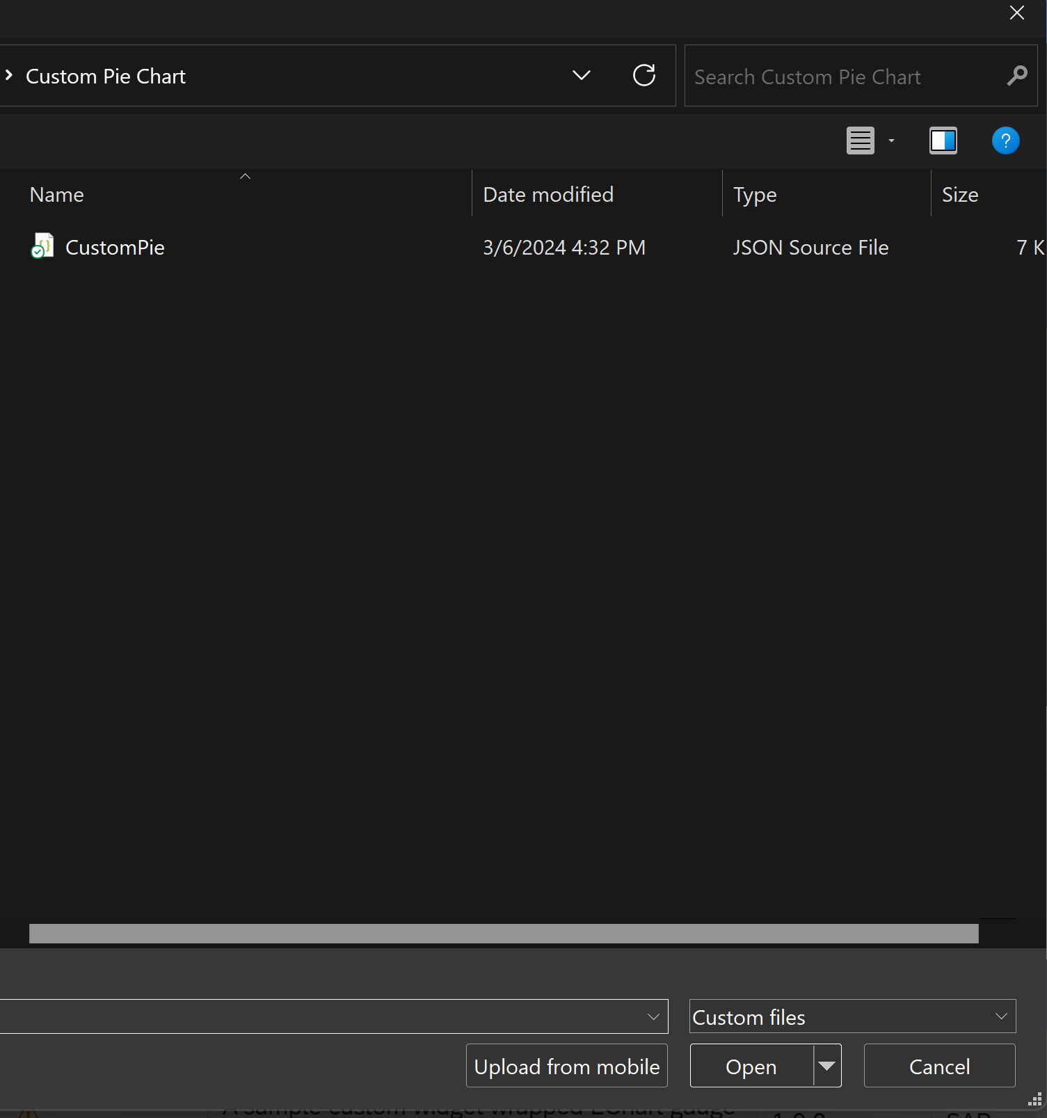
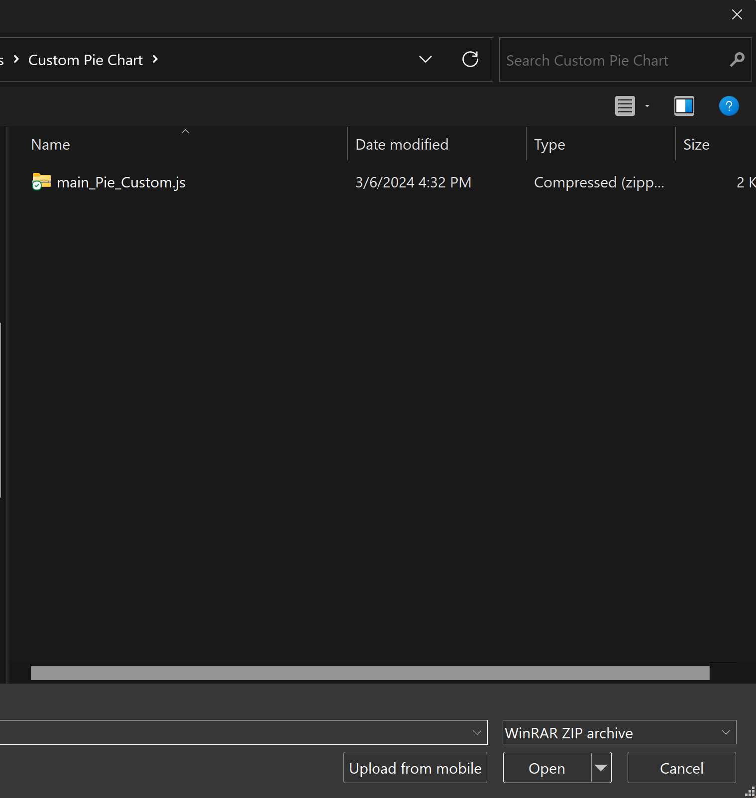
1. Clone this GitHub repository with the sample Custom Widgets locally into your PC.
2. On SAC go to Story > Custom Widgets and click on the “+” to create a new Custom Widget

3. Then click on Select File, Navigate to the cloned repository, and select the folder of the Custom Widget you want to install. There you want to select the JSON and the ZIP files.

4. Click on “Continue” and that’s it.
Now you can create a new Story and if you click in “Insert” you will find a subcategory “Custom Widgets” with all the Custom Widgets you’ve installed.
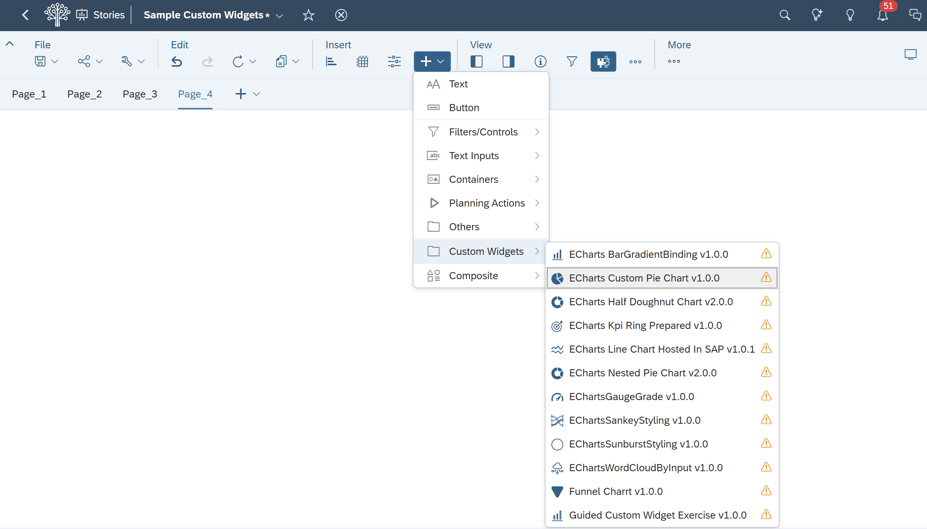
It’s that simple. And they work just as simply as any other out-of-the-box chart.
There are also many more samples out there. The ones that I showed here are only a few of them. So, what are you waiting for? Spice up your SAC Stories with Custom Widgets. It’s a small detail, but I guarantee you it will make your Stories stick out more and display your data a little bit more intuitively. Try them out!
Continue the conversation with the author

Marvin Scherer
Consultant SAP & Data Analytics
Book a free 30-min call with Marvin and leave with clarity on your next step.
Pick your time in 60 seconds
