Building a Financial Report in SAP Analytics Cloud: A Step-by-Step Tutorial with Sample Data, Hierarchies, and Interactive Stories
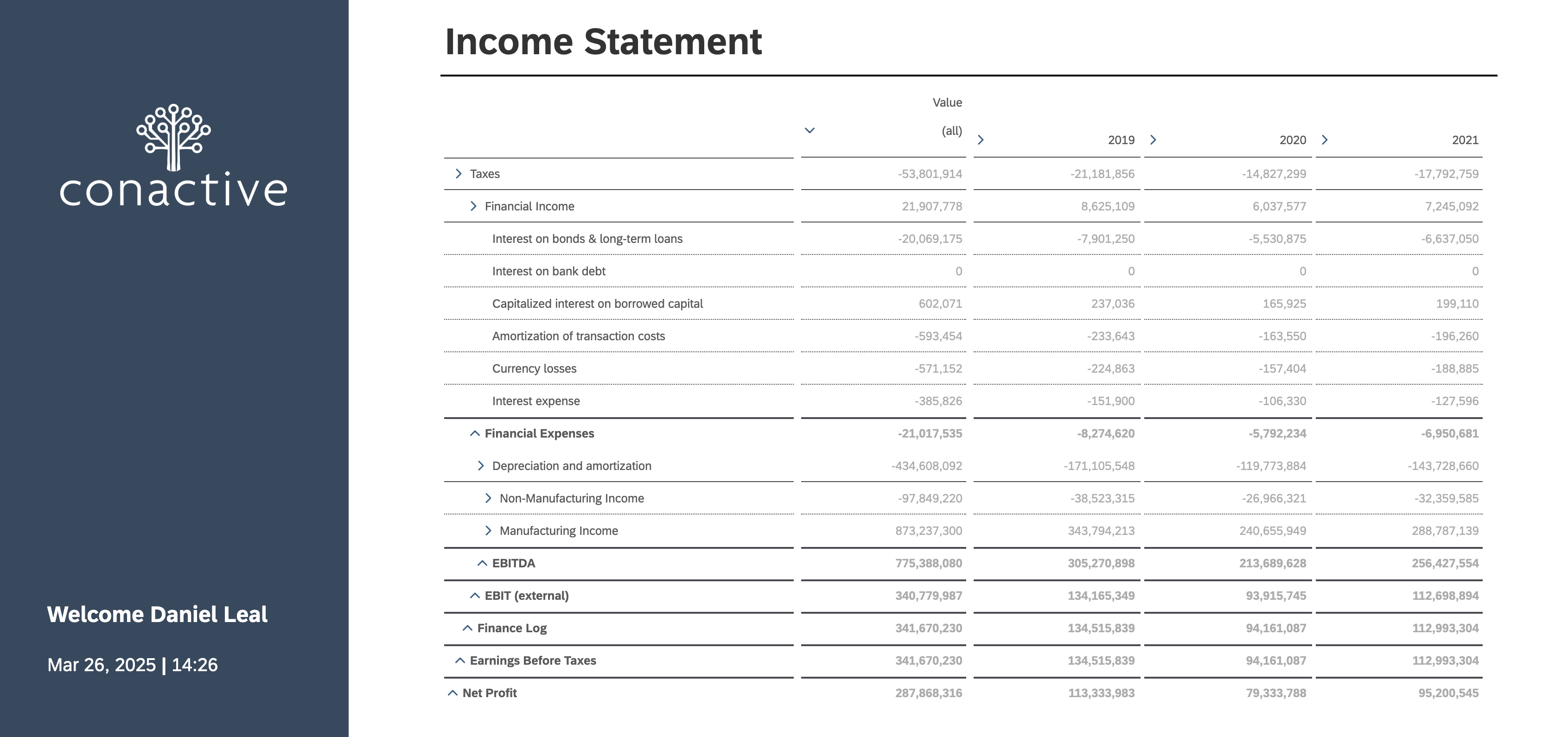
In this tutorial, we’ll walk through the process of building abasic financial statement using SAP Analytics Cloud (SAC). Whether you’re a financial analyst, BI consultant, or just exploring SAC forthe first time, this guide will give you hands-on insight into creatingimpactful financial reports.
SAP Analytics Cloud combines data modeling and storytelling in oneunified platform. To make the most of it, it’s important to understand its twocore components:
- Model (Back-End): This is where we define the data structure, upload and transform our data, andcreate calculated measures.
- Story (Front-End): This is where we visualize the data, build dashboards, and create interactivefinancial statements.
We’ll begin with building the model—uploading our financial dataand formatting it appropriately. From there, we’ll move on to creating a story that brings the data to life with visualizations and insights.
Let’s dive in.
Uploading Data
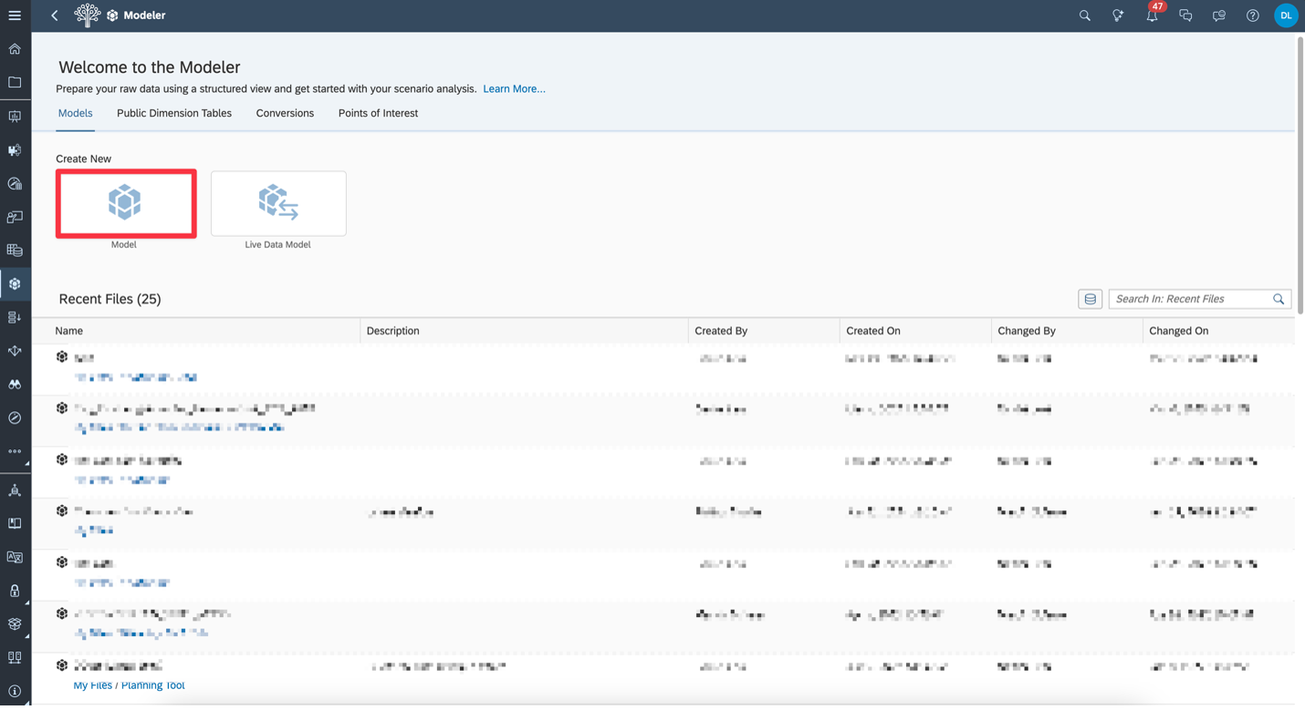
Create a Model | We start by creating a new Modelin SAC. Go to Files, click the +icon, and select Model from the dropdown. This will letus upload and structure the financial data we’ll use in the report.

Choose the Model Type | Select the Model option (not Live Data Model), since we’ll be uploading an Excel file as our data source.
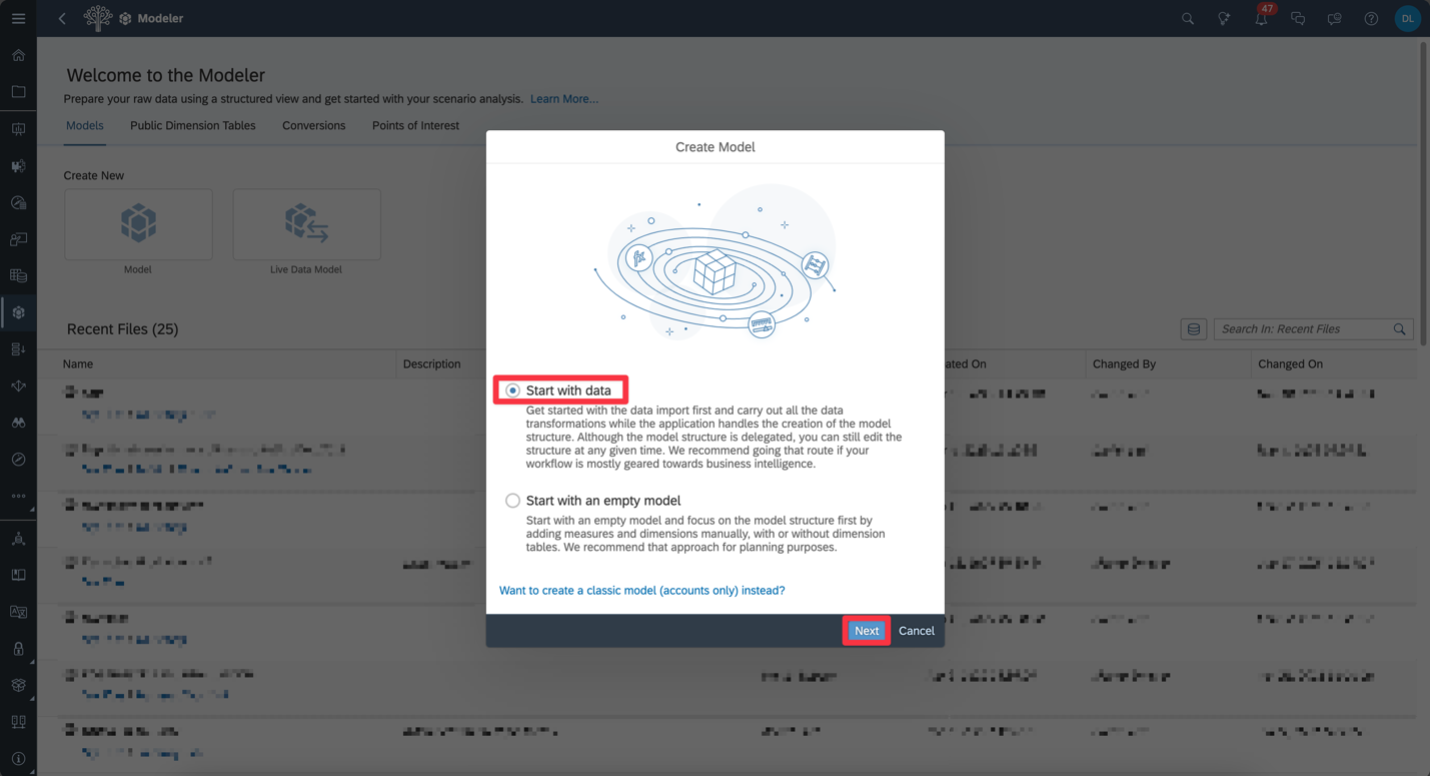
Start with Data | Choose Start with data so we can upload the Excel file and let SAC help structure the model automatically. Then click Next.
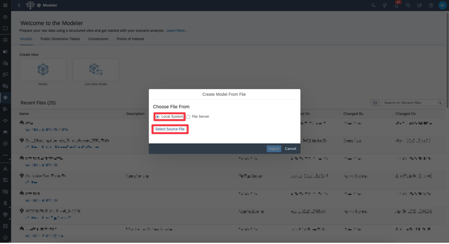
Select Data Source | Choose File (Local File or File Server) to upload the financial data directly from your Excel file.

Upload the File | Select Local System, then click Select Source Files to upload your Excel file into SAC.
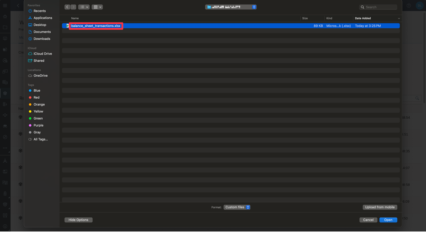
Choose Your File | Select your Excel file and click Open to begin the upload.
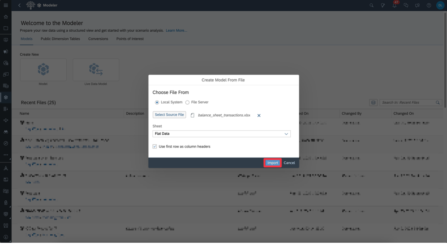
Confirm File and Import | Select the correct sheet from your Excel file (if there are multiple), check “Use first row as column headers,” then click Import.
Data Preprocessing & Transformations
After upload, review your columns. Ensure each has the correct data type—especially dates. In this example, we need to format the Date column properly and set up a time hierarchy.
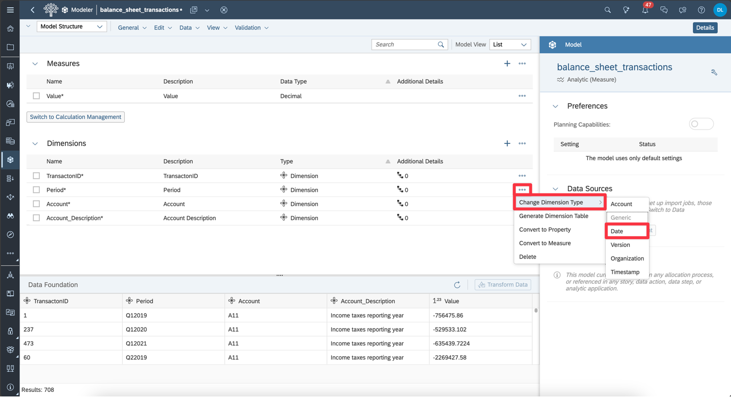
Convert Period to Date | To enable time-based analysis, change the Period dimension type to Date using the options menu.
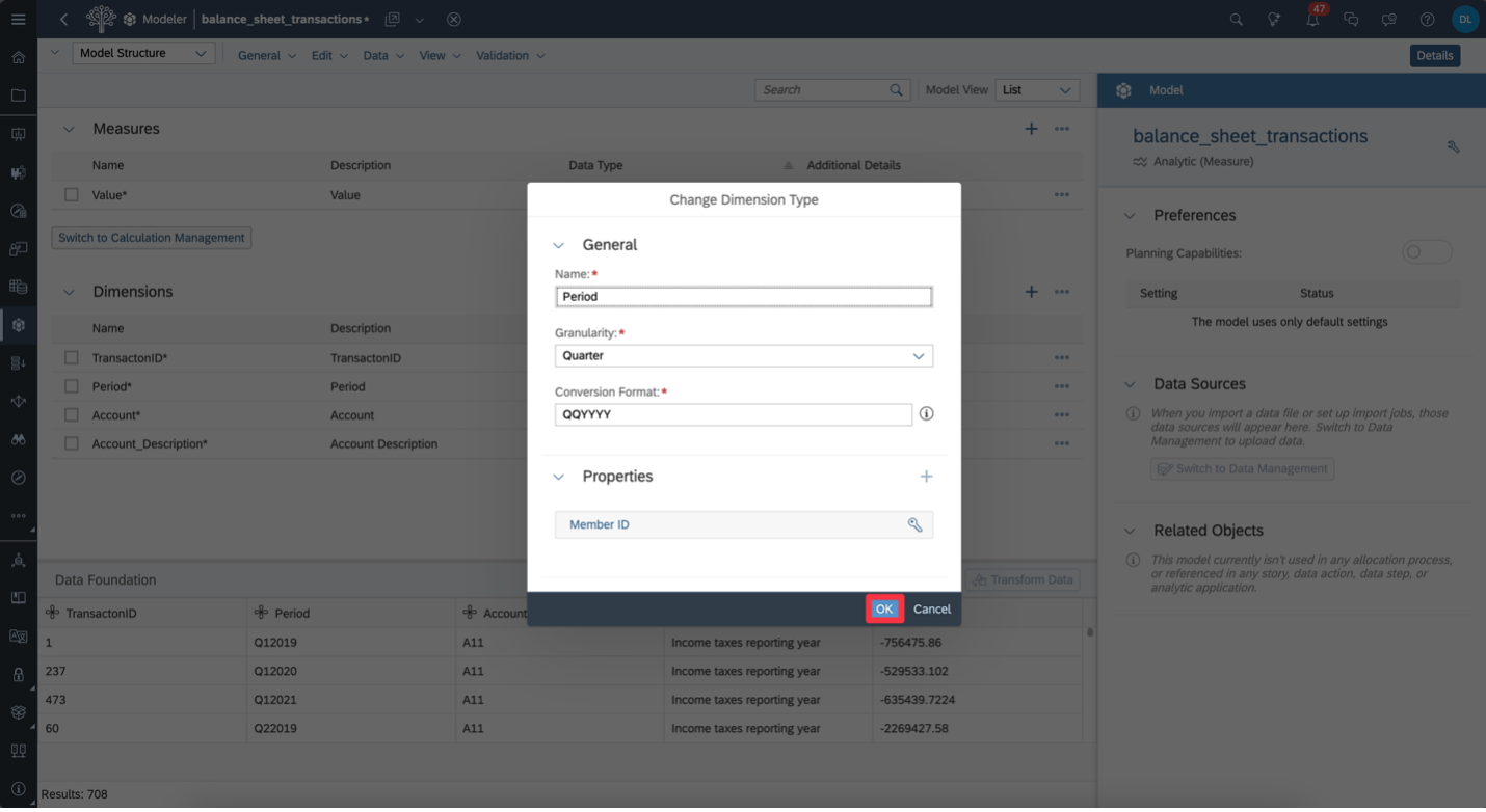
Set Date Granularity and Format | Set the Granularity to Quarter and match the Conversion Format to your data—here it’s QQYYYY. Then click OK.
Creating Account Parent-Child Hierarchy
Now that our time dimension is correctly formatted, we’ll move onto creating an Account Hierarchy.
This is one of the most powerful features in SAP Analytics Cloud. Hierarchies allow you to organize and group accounts in a structured way,enabling dynamic drill-downs and aggregated views in your reports. With just afew steps, you can replicate your chart of accounts, categorize entries like Assets, Liabilities, Equity, and visualize the structure just like in atraditional balance sheet.
In the next steps, we’ll build this hierarchy directly in the modelso it’s ready for use in our story.
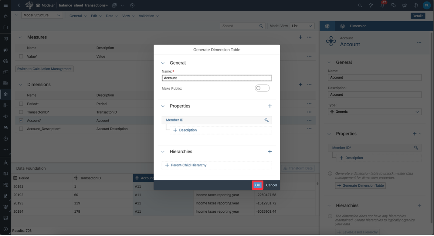
Generate Dimension Table | Select the Account dimension, then click Generate Dimension Table to start building the account hierarchy.

Confirm Dimension Table Settings | Keep the default settings and click OK to generate the dimension table for the Account hierarchy.
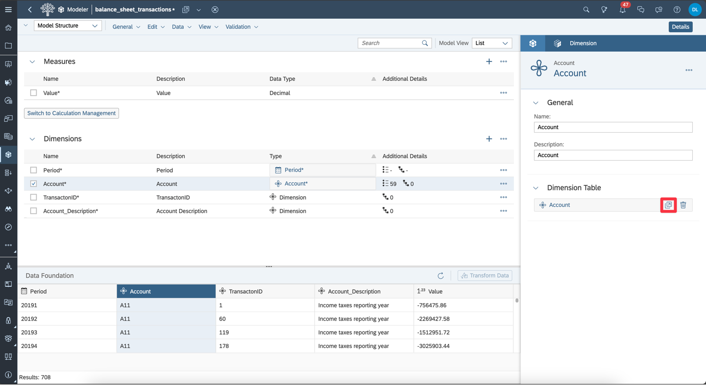
Open the Dimension Table | Once the dimension table is created, click the table icon to open and edit the Account hierarchy.
Create the Hierarchy | Inside the Account dimension table, scroll to the right panel and click Create Hierarchy. Choose Parent-Child Hierarchy to organize your account structure.

Name the Hierarchy | Give your hierarchy an ID and Description—for example, H1 and Account Hierarchy—then click Create.

Prepare the Hierarchy in Excel | The account hierarchy hasbeen prepared in Excel using the proper format: Member ID,Description, and Parent Node. You can simply copy and paste this directly into SAC.
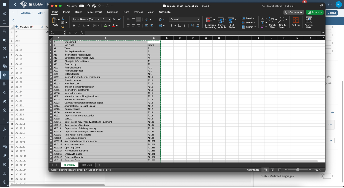
Paste and Validate the Hierarchy | Paste your hierarchy intoSAC and make sure there are no errors—check for missing parent nodes or inconsistent relationships in the structure.
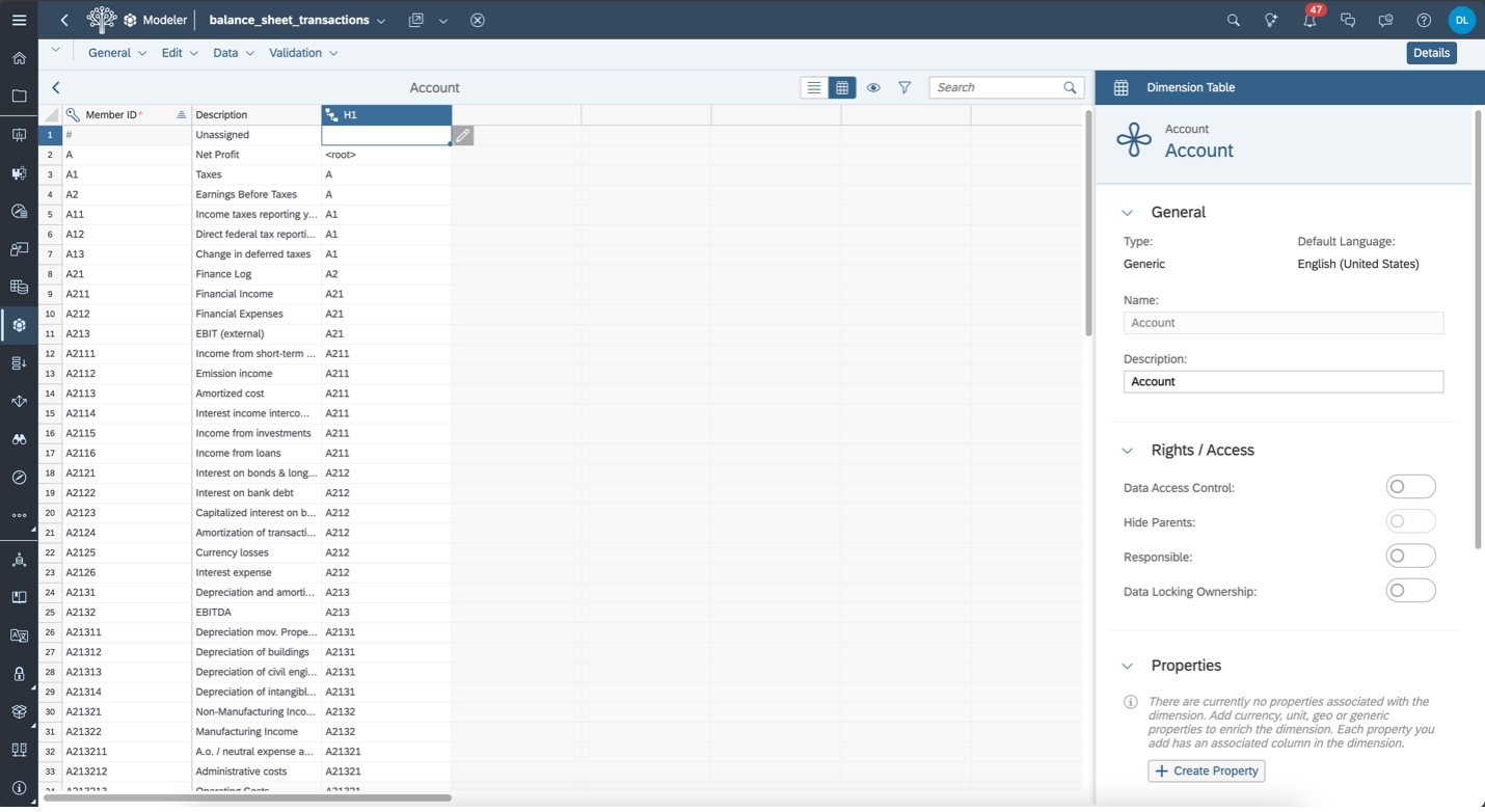
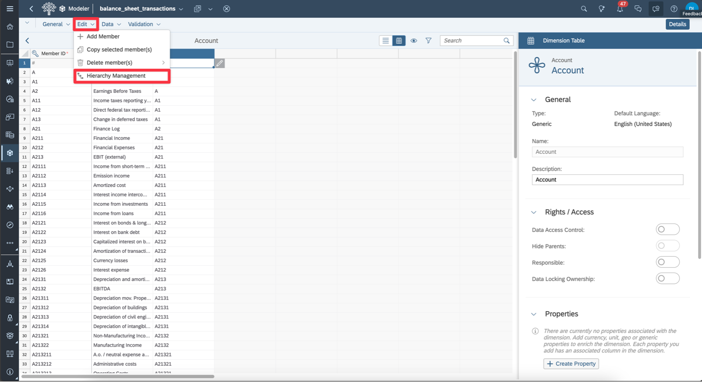
Use Hierarchy Management | You can also access Hierarchy Management from the Edit menu to visualize and adjust the structure more easily if needed.
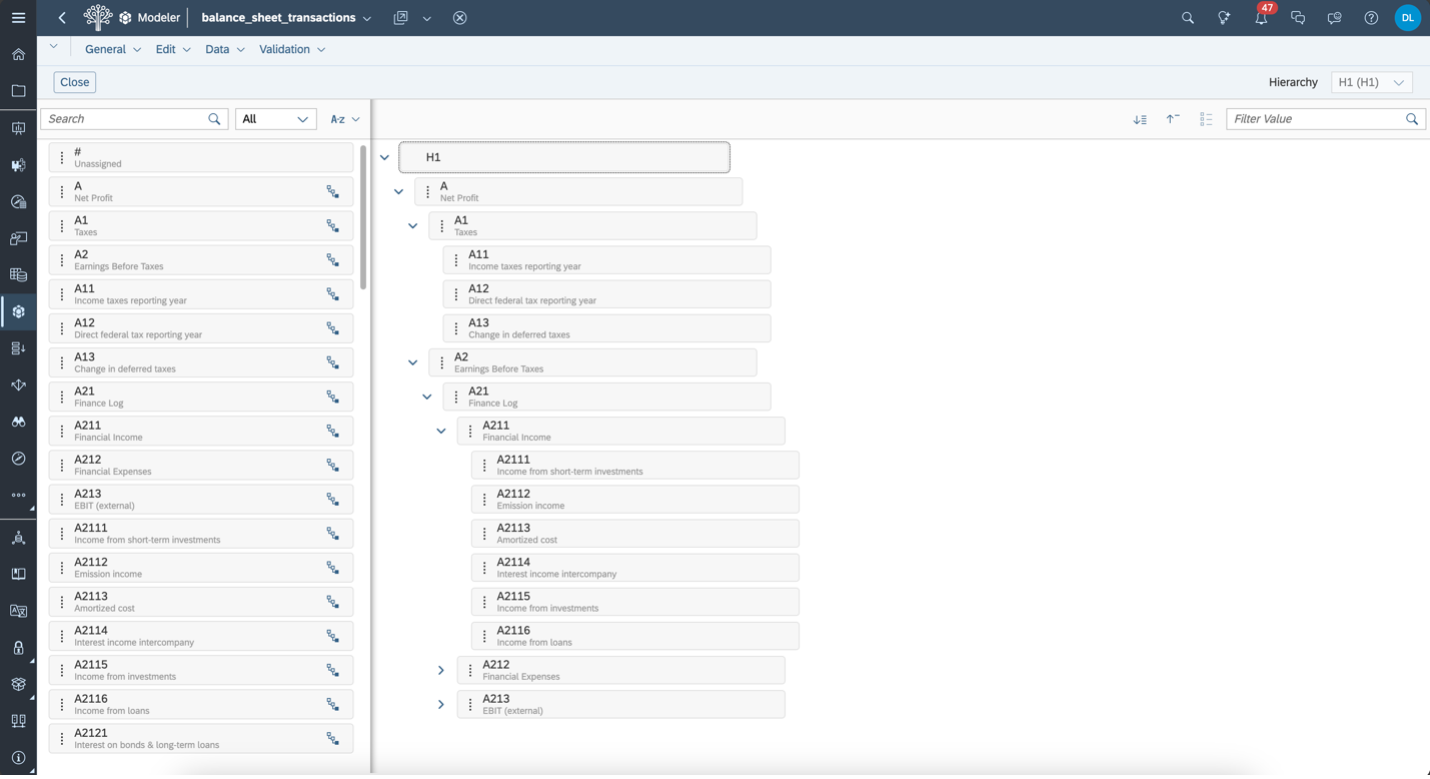
Drag-and-Drop Hierarchy View | This alternative Hierarchy Management view lets you drag and drop elements to easily restructure your chart of accounts visually.
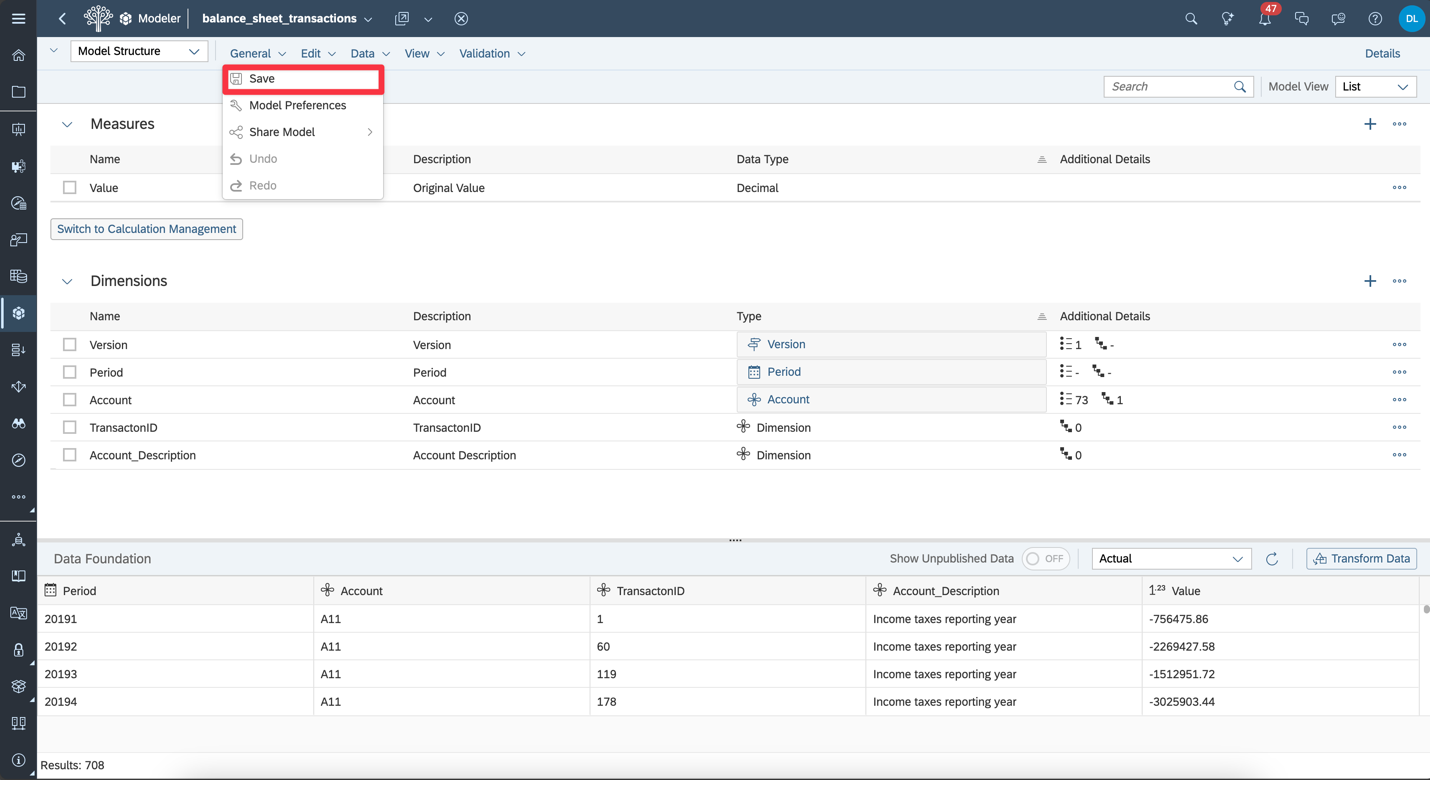
Save the Model | Once your data and hierarchy setup are complete, go to the Data menu and click Save to store your model.
Front-End Development: Creating a Story
With our model complete, we now move on to the Story, where we’ll bring our financial data to life through visualizations.
In this example, we’re working with a pre-defined story template. We’ll connect it to the model we just created and begin building out key elements like data tables and charts to visualize the account hierarchy and financial values clearly.
Let’s get started by linking the model to the story.
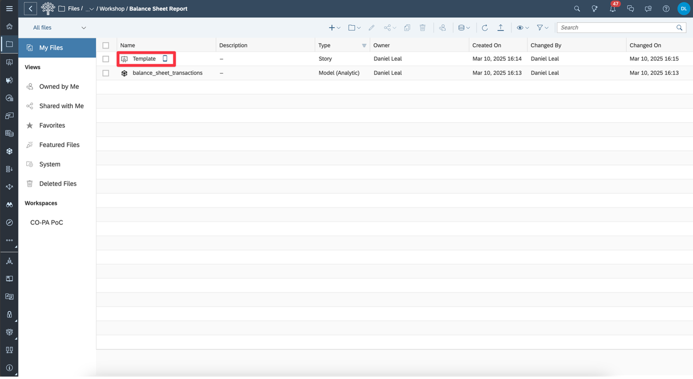
Open the Story Template | Your saved Model and Story Template should now appear in the same folder. Open the Template story to begin building the report.
Connect the Story to Your Model | With the template open,click the Data icon in the toolbar, then choose the Model option to connect your financial data.
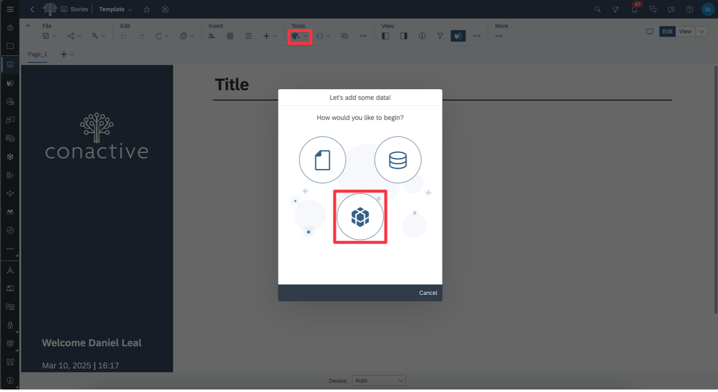
Select the Model | Locate and select the model from yourfile system to link it to the story.
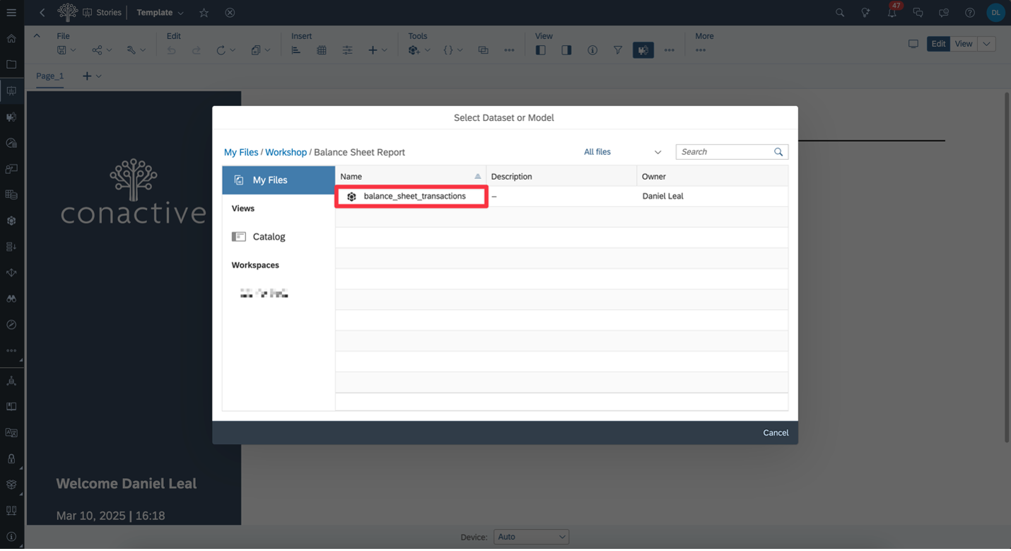
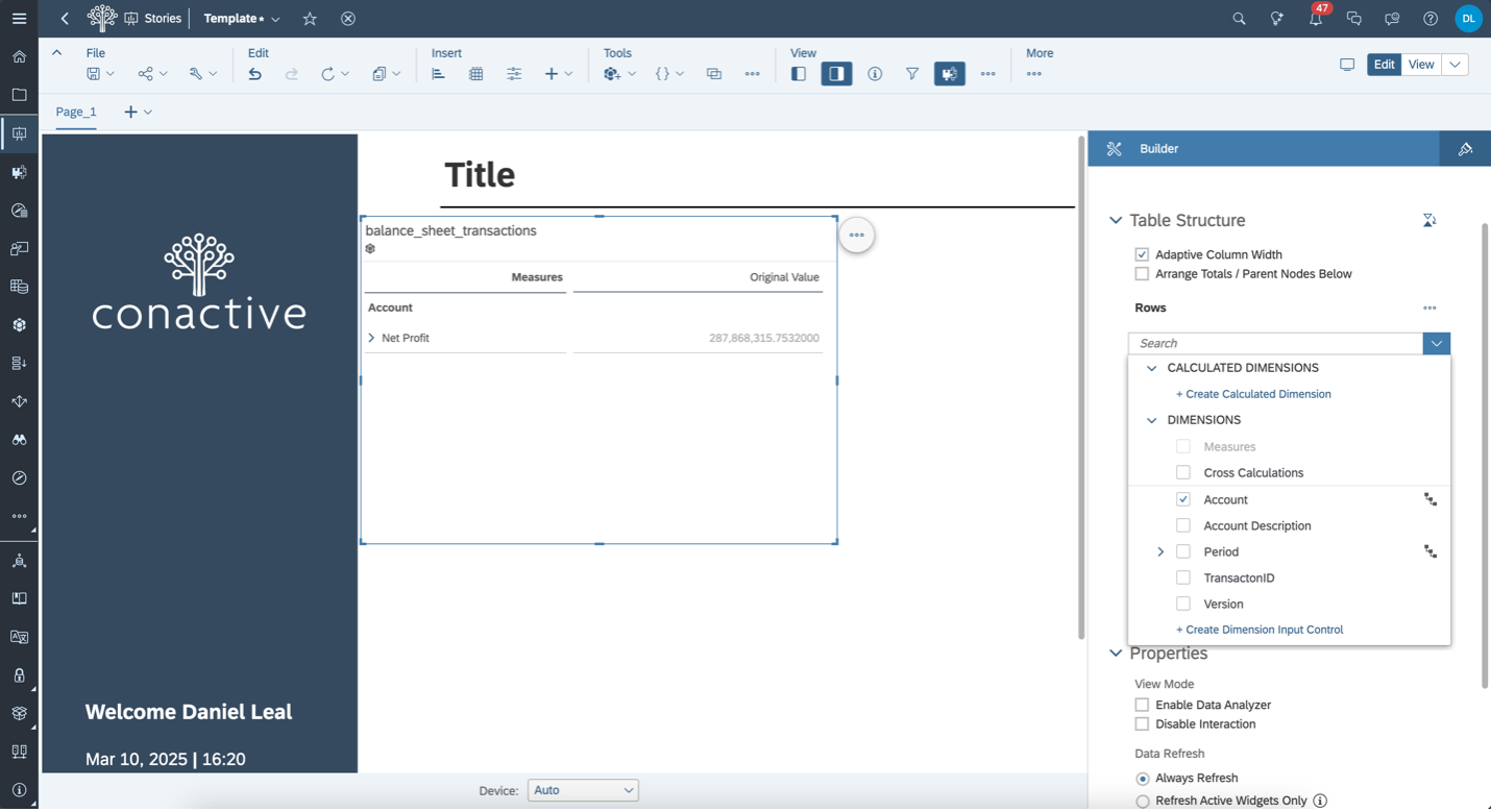
Insert a Table | Once the model is connected, insert a table from the toolbar to start displaying your financial data. You can now configure dimensions, measures, and filters on the right-hand panel.

Add Account to Table Rows | To create a financial statement layout, select Account as the Rows field. This will structure your table based on the account hierarchy defined earlier.
Add Measures and Period to Columns | To break down values bytime, add both Measures and Period to the Columns. This lets you view account values by quarter or year.
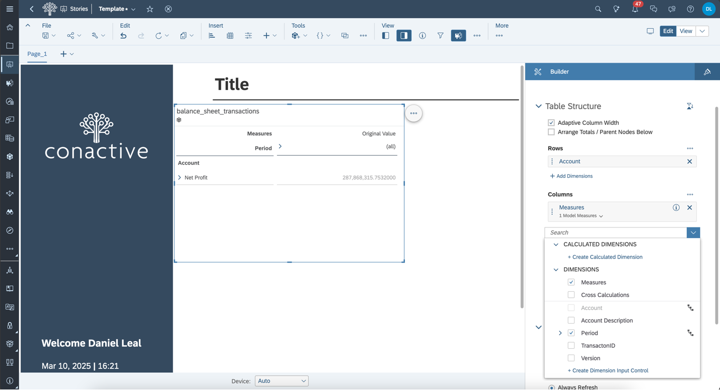
View with Dropdowns | You should now see the table populated with data. Dropdowns for both Measures and Period allow users to interactively explore values across time and metrics.
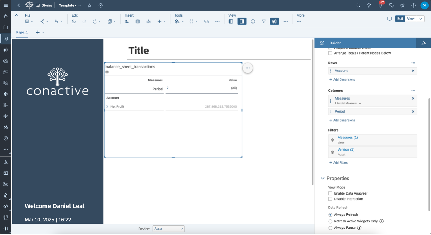
Apply Styling Preset | For quick formatting, go to the Styling tab and choose a preset—like Report Styling—to give your table a clean, professional look with minimal effort.

Hide Table Metadata | To keep the view clean and focused, you can hide metadata like the data source name or technical labels—helping users concentrate on the key financial figures.

Interact with the Hierarchy | Now your financial report is live and interactive. Use the expand/collapse arrows to navigate through your Account Hierarchy and verify that all levels and totals display correctly.
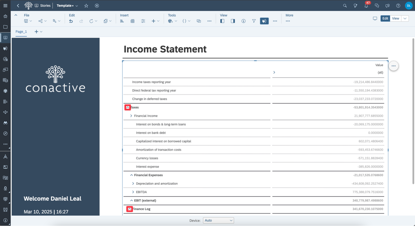
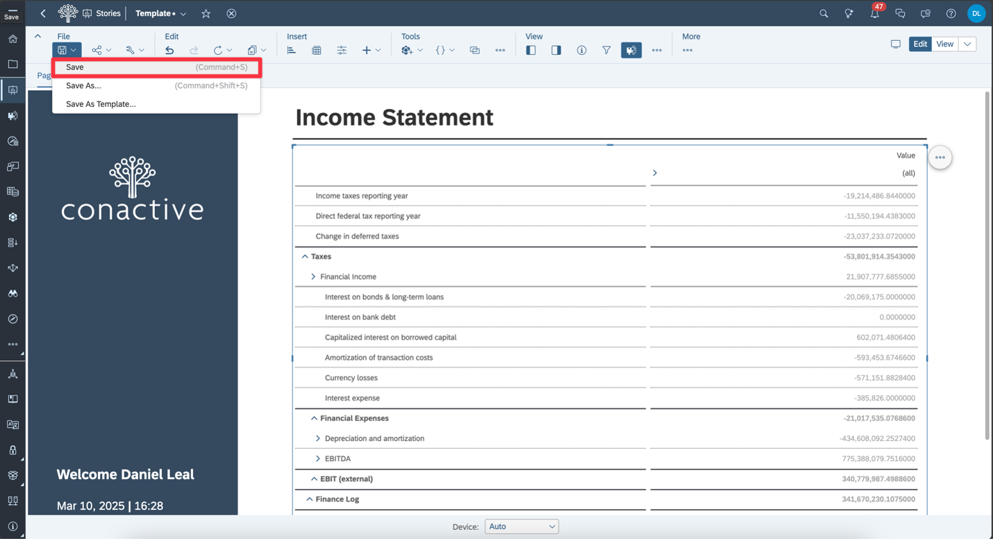
Save the Story | Once everything looks good, go to File > Save to save your completed Income Statement report.
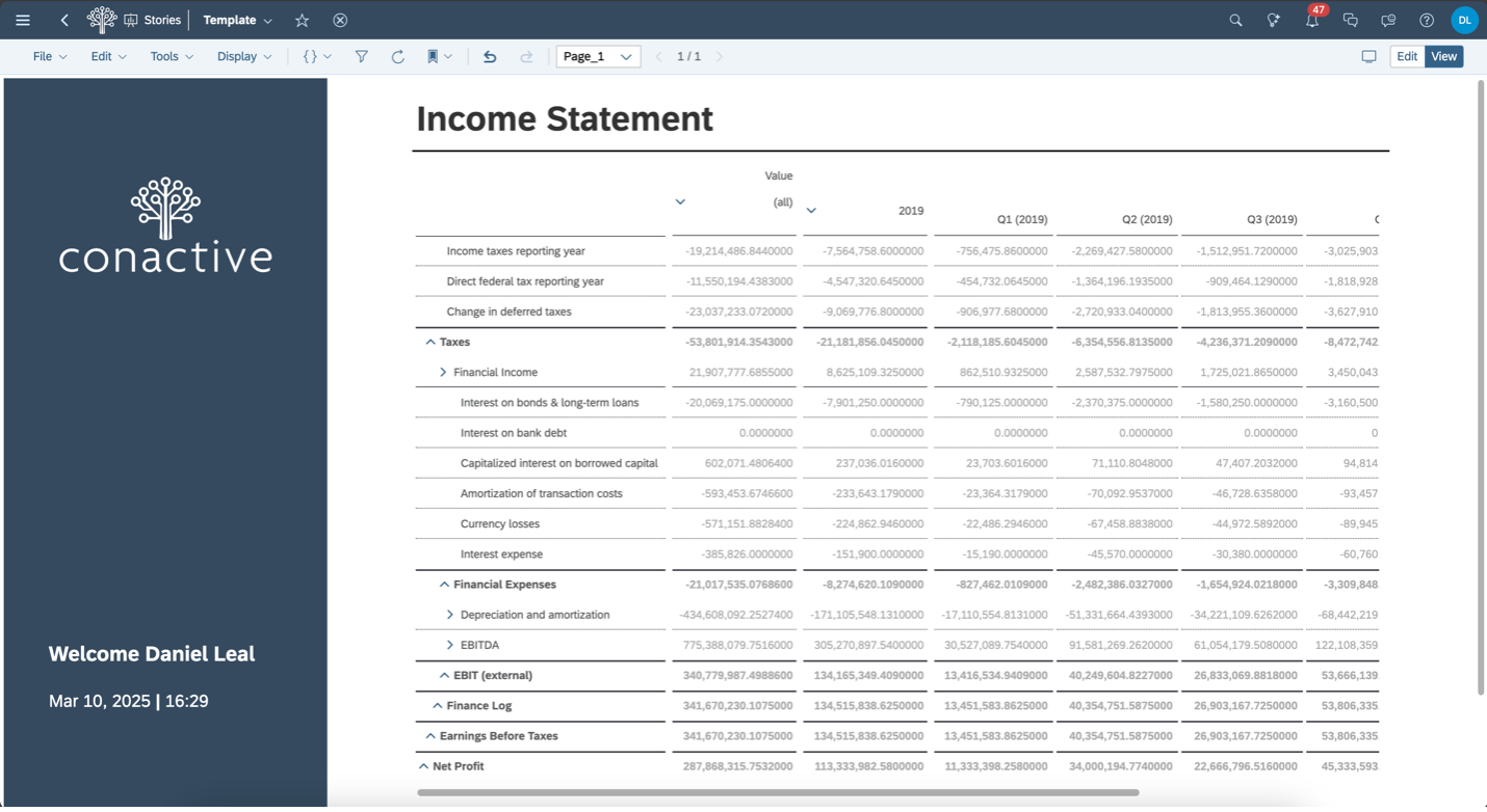
Explore Different Time Granularities | Use the Period dropdown to toggle between annual and quarterly views, giving users flexible ways to analyze financial performance.
Conclusion
In this tutorial, we built a complete financial report in SAP Analytics Cloud, starting from raw data and finishing with an interactive, styled Income Statement.
We covered:
- Building the data model with proper data types and hierarchies.
- Creating an Account Hierarchy to reflect a real-world chart of accounts.
- Designing a story with a table that lets users drill into values by period and metric.
- Adding styling and interactivity to make the report clean and user-friendly.
Whether you’re building dashboards for internal finance teams orexecutive-level reports, SAC gives you the tools to create insightful,interactive, and scalable financial stories.
If you would like to explore this further, we’re happy to share the demo data and story template used in this tutorial—completely free and with no strings attached. Just reach out to us by email, and we’ll send it your way.
Author

Daniel Leal
Developer


